Building a Progress Dashboard for Data-Driven Decisions
04 November 2025
How I turned my workout notebook into an interactive dashboard that helps me and my trainer make real decisions about my fitness routine
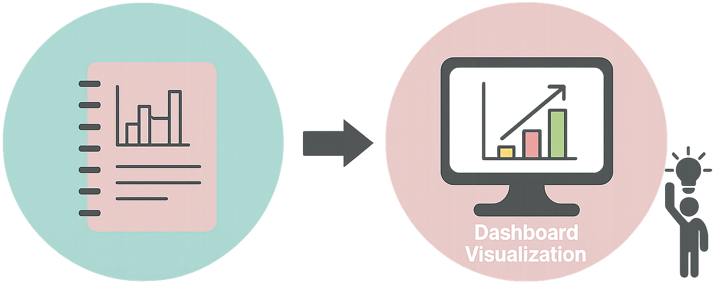
When I first started going to the gym regularly, I did what many people do: I tracked my workouts in a notebook. Exercise names, sets, reps, weights. All handwritten, week after week. It was fine for a while, but as time went on, I realized I was sitting on a goldmine of data that I couldn’t really use. I could see individual entries, but I couldn’t see patterns. I couldn’t answer questions like: “Which exercises show the most progress?” or “Are there days of the week where I perform better?”
This is when I decided to build a dashboard that would transform my workout logs into actionable insights. In this post, I’ll share how I built a fitness tracking dashboard using Looker Studio and Google Cloud SQL, and how it’s helping me and my trainer make data-driven decisions about my training routine.
The Problem: Data Rich, Insight Poor
Like many people passionate about data, I found myself in a situation where I had plenty of data but limited ways to extract meaningful insights from it. My workout notebook contained:
- Exercise details: Exercise names, muscle groups, equipment used.
- Performance metrics: Sets, reps, weights, rest periods.
- Temporal data: Dates, times, workout durations.
- Context: How I felt, energy levels, notes about form.
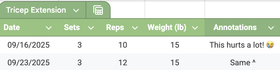
But I couldn’t easily answer questions that would help me optimize my training. Some of the key questions I wanted to find an answer to were: What’s my actual progression rate over time? Do I perform better on certain days? Which exercises show the most consistent progress? How can my trainer and I use this data to fine-tune my routine?
The notebook was great for recording, but terrible for analysis. I needed a way to visualize trends, compare periods, and identify patterns that would inform my training decisions.
The Solution: From Notebook to Cloud Dashboard
I decided to build a dashboard using Looker Studio (formerly Google Data Studio) connected to Google Cloud SQL. This combination would give me the flexibility to store my data in a structured way and create dynamic, interactive visualizations. Additionally, Looker Studio’s user-friendly interface would allow both me and my trainer to explore the data without needing to write any code.
I set a few non-negotiables before starting:
- Shareability: If my trainer can’t open it and get it in a few clicks, it fails.
- Real-time updates: Log a workout at 7pm, see it on the dashboard at 7:10—that was my bar.
- Interactivity: The magic isn’t just looking at stats, but slicing and dicing to see “how did leg volume change this month?” or “why can’t I get over 10lb in tricep extensions?”
Looker Studio was the ideal choice for all this: quick setup, free for personal use, and great visualization design out of the box. Plus, its native Google Cloud SQL connector saves you from hacking together brittle scripts.
So here’s exactly how I made it real:
Step 0: Collecting and Structuring the Data
We have to start somewhere.
Before building the dashboard, I needed to get my workout data into a structured format. Initially, I had everything scribbled in a notebook, which made analysis impossible. My baby step here consisted in starting a Google Sheet that fits real gym habits -not ideal data-, but the actual messiness of routine. My spreasheet at the very begining was tracking:
- Workouts: date, duration, notes (for the random “felt tired”, or “hate burpees” kind of stuff).
- Exercises: linked to each workout, tagged by exercise type (upper or lower body).
- Sets: every weight, rep, and rest interval gets its own row.
This means I can gather all the data in a systematic way to analyze, or at least, visualize, my progress over time and get some insights into my routine and fitness goals.
Although a small step, this was crucial to get the data in a structured format that I could later import into a proper database. Identifying the type of data I wanted to track and how it related to my workouts set the foundation for everything that followed.
Step 1: Designing the Database Schema
The first step was to design a proper database schema to store my workout data. I needed to capture the hierarchical nature of workout data: workouts contain exercises, exercises contain sets, and each set has specific repetitions and associated metrics.
-- Simplified schema example
CREATE TABLE workouts (
    workout_id INT PRIMARY KEY,
    date DATE NOT NULL,
    duration_minutes INT,
    notes TEXT
);

CREATE TABLE exercises (
    exercise_id INT PRIMARY KEY,
    workout_id INT,
    exercise_name VARCHAR(255),
    muscle_group VARCHAR(100),
    FOREIGN KEY (workout_id) REFERENCES workouts(workout_id)
);

CREATE TABLE sets (
    set_id INT PRIMARY KEY,
    exercise_id INT,
    set_number INT,
    reps INT,
    weight_kg DECIMAL(5,2),
    rest_seconds INT,
    FOREIGN KEY (exercise_id) REFERENCES exercises(exercise_id)
);
This normalized structure allowed me to track individual workouts, exercises within those workouts, and sets within each exercise. It also made it easy to maintain data integrity and perform complex queries for analysis.
Step 2: Setting Up Cloud SQL
For the backend, I went with Google Cloud SQL. It just made sense. The integration with Looker Studio is simple, and I never had to worry about outgrowing my dataset or dealing with clunky connections. I am planning to keep adding more data over time, so having a scalable solution was important.
Once my database was ready, importing my workout backlog took a bit of manual effort, but after that, adding new sessions became second nature. The whole thing updates quietly in the background while I focus on lifting (and, sometimes, logging notes on the walk home).
Step 3: Connecting Looker Studio to Cloud SQL
Looker Studio offers several built-in connectors such as Google Sheets, BigQuery, and Google Cloud SQL. Here is a screenshot of the Looker Studio connectors options available:
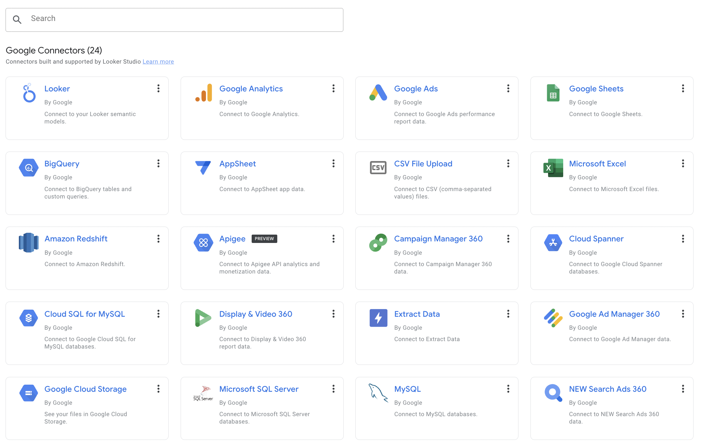
I used the Google Cloud SQL connector to link my database to Looker Studio. The process involves:
- Creating a data source: In Looker Studio, I added a new data source and selected “Google Cloud SQL”.
- Configuring the connection: Entered connection details including instance connection name, database name, and credentials.
- Writing SQL queries: Created custom SQL queries to transform raw data into the metrics I wanted to visualize.
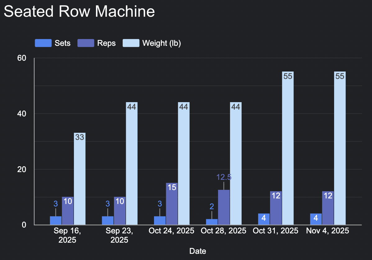
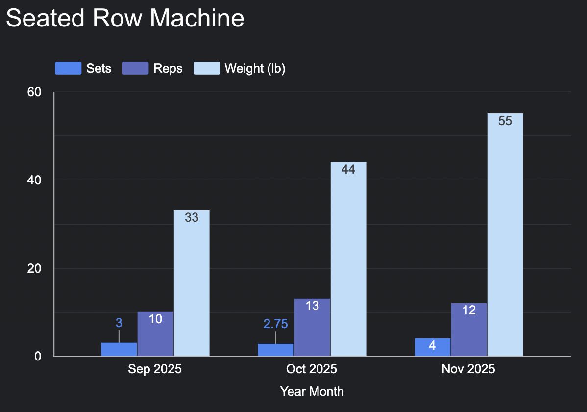
The SQL queries became the foundation for all my visualizations. For example, to show progress over time for a specific exercise:
SELECT
    w.date,
    e.exercise_name,
    AVG(s.weight_kg) as avg_weight,
    AVG(s.reps) as avg_reps,
    SUM(s.weight_kg * s.reps) as total_volume
FROM workouts w
JOIN exercises e ON w.workout_id = e.workout_id
JOIN sets s ON e.exercise_id = s.exercise_id
WHERE e.exercise_name = 'Bench Press'
GROUP BY w.date, e.exercise_name
ORDER BY w.date
Step 4: Building the Dashboard
With the data connection established, I started building the dashboard. I organized it into several key sections:
Overall Progress Overview
Since I was interested in tracking my overall progress, I created summary cards and trend lines showing key metrics like numbers of sessions, and because I split my training into different lower and upper body days, I created separate views for each. I also added two gauge charts to visulize the number of workouts completed against my goal. But also, because lower body has a higher priority in my training, I added a target line to visualize how far I am from my goal.
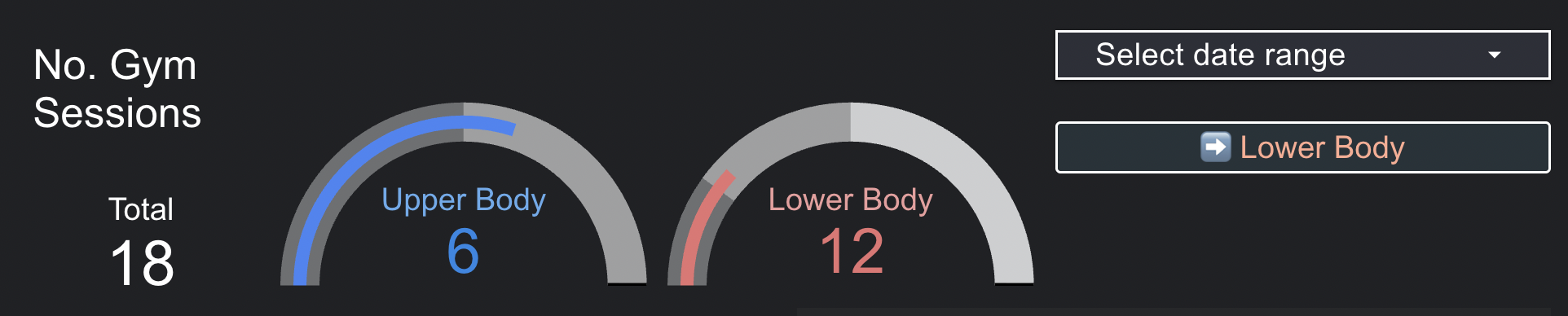
With this visualization I can quickly see how consistent I’ve been with my training and whether I’m on track to meet my goals, keeping in mind I want 2x the number of lower body workouts compared to upper body.
Step 5: Making It Interactive
One of the most powerful features of Looker Studio is interactivity. I added:
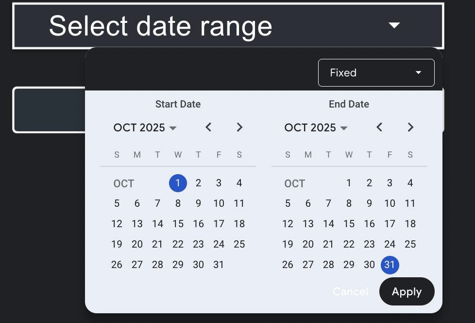
- Date range filters: Visualize progress over specific time periods using date ranges.
- Drill-down capabilities: Click on summaries to see detailed breakdowns and compare them with its averages.
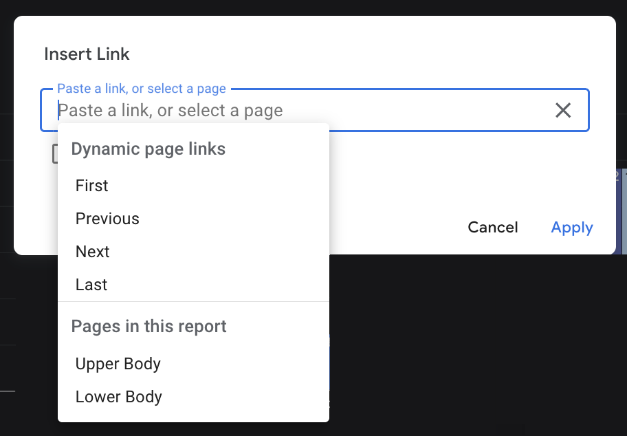
- Dynamic controls: Buttons and dropdowns to adjust what’s displayed and to navigate to different pages of the dashboard.
This interactivity makes the dashboard useful not just for viewing, but for exploring. When my trainer asks “How has your squat improved over the last month?”, I can quickly filter and show exactly that.
Take home messages
This project reinforced several important lessons about data visualization and personal data projects:
1. Start Simple, Then Iterate
I didn’t build the entire dashboard at once. I started with a single chart showing progress over time, and actually I started with a simple but effective Google sheets called test that I used to try several options for a table with relevant data. Then tried multiple visualizations as I identified what questions I wanted to answer. Then I moved to Cloud SQL because I needed more structure and scalability. This iterative approach made the project manageable and allowed me to learn what was actually useful.
2. The Right Tool for the Job
Looker Studio was perfect for this use case because:
- It’s free for personal use!
- It connects easily to Cloud SQL.
- It requires no code.
- It’s shareable and accessible.
- It updates automatically as data changes.
3. Data Quality Matters
The dashboard is only as good as the data it’s based on. I learned to be consistent with data entry (e.g., always using the same exercise names, consistent units) to ensure accurate analysis.
4. Visualization is About Communication
The best visualizations aren’t necessarily the fanciest ones. The best visualizations are the ones that clearly communicate insights. Seeing my workout data reflected on a dashboard was an eye-opener, but making sure the charts were easy to understand and interpret was key. I spent time refining charts to make them intuitive and focused on what matters most and that helps me and my trainer make decisions to reach my fitness goals.
The Pitfalls
No product is perfect from day one. And Looker, regardless of being a Google product, is no exception. While building and using the dashboard, I encountered several pitfalls that are worth mentioning for anyone considering a similar approach.
1. Limited Customization
Looker Studio has some limitations in terms of customization compared to more advanced BI tools. I had to work within the constraints of available chart types and formatting options. However, for my use case, the trade-off was worth it for ease of use and accessibility.
2. Performance with Large Datasets
As my dataset grew, some queries became slower. I had to optimize SQL queries and use indexing in Cloud SQL to maintain performance. For very large datasets, more robust BI tools might be necessary.
3. Caching Issues
Looker Studio caches data to improve performance, which can lead to delays in reflecting the latest data. I had to be aware of this when making frequent updates and sometimes manually refresh the data source. To me, it wasn’t evident. But there is one little button hiding in the data source settings that says “Refresh Fields”, which I had to use often to make sure the latest data was being pulled.
4. Formulas and Calculated Fields Limitations
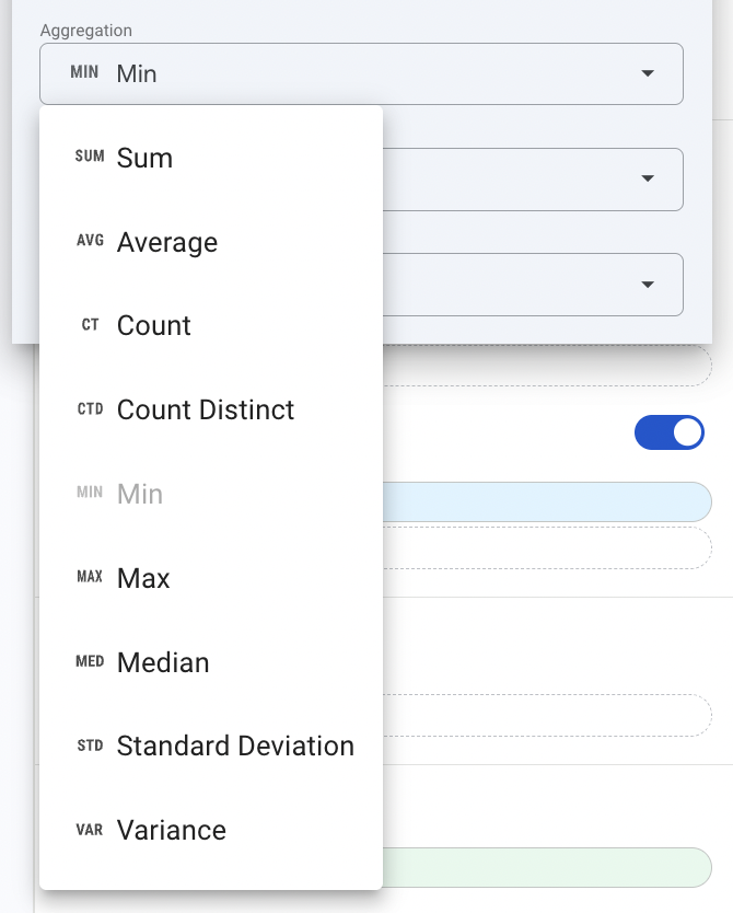
Looker Studio’s calculated fields have limitations compared to full SQL capabilities. For complex calculations, I had to rely on SQL views in Cloud SQL rather than Looker Studio’s built-in functions. For example, I foudn that Looker always aggregates data, which can lead to unexpected visualization results. Unfortunately, Looker doesn’t offeer an option to disable aggregation at the chart level. The options are: Sum, Average, Count, Count Distinct, Min, Max, Median, Standard Deviation, Variance. So, if you want to display raw data without aggregation, you have to create a calculated field with the formula Field Name + 0 to trick Looker into treating it as a non-aggregated field.
5. Sharing the dashboard
Looker has an option to share the dashboard with other users, which is straightforward. However, for dashboards with several pages, I found that the link shared would change depending on the last page viewed. This could be confusing for users accessing the dashboard for the first time, as they might not land on the intended overview page. Or, it can also happen that if the link is shared from any page different than the first one, the user may not be able to access the full dashboard.
Conclusion
What started as a simple desire to understand my workout data better has become a powerful tool for data-driven fitness decisions. The dashboard has transformed how I track progress, how I collaborate with my trainer, and how I make decisions about my training routine.
More importantly, this project demonstrates that data visualization and analytics aren’t just for business or research—they can be applied to personal goals and daily life. Whether you’re tracking fitness, finances, habits, or any other aspect of your life, the principles of data collection, storage, visualization, and analysis can help you make better decisions.
If you’re interested in building something similar, the good news is that the tools are accessible and the learning curve for Looker is actually very reasonable. Start with a simple question you want to answer, collect some data, and build from there. You might be surprised by what you discover.
My workout dashboard is available here, and I am hoping to keep the data updated over time to track long-term progress (A.K.A. going to the gym!).
Happy tracking and keep it up with your fitness goals! 💪📊